Case Study 05
HARMONY CFO SOLUTIONS
Trust, structured. Prosperity, signalled.
Client
Harmony CFO Solutions
Sector
Financial Consulting
Region
Texas, USA
Year
2024
Role
Brand Identity, Guidelines, Stationery
01 — Challenge
A new CFO practice with no brand to walk into the room ahead of him.
Michael Bailey was launching an outsourced CFO practice aimed at small businesses across the United States. A CPA with deep financial expertise, a clear market positioning and a mission to empower small business owners toward prosperity and growth. What he did not have was a brand that could communicate any of that before he walked into the room. Starting from scratch, the identity needed to do serious work. It had to signal trust to business owners who were about to hand over their financial operations to someone they had never met before.
02 — Approach
Deep teal for trust. Gold for prosperity. Neither one competing.
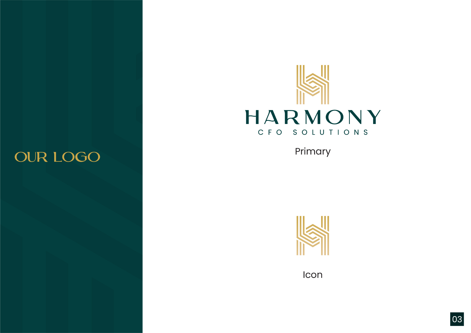
The brief carried one clear emotional target. Trust and prosperity. Two qualities that pull in slightly different directions visually, trust asks for restraint, prosperity asks for richness, and the challenge was holding both without one undermining the other. The decision was to build the system around deep teal as the dominant colour. Not the safe corporate navy that every financial firm defaults to, but a deeper, richer green-teal that sits between the stability of blue and the growth signal of green. Gold was chosen as the accent not for decoration but for what it earns in a financial context. Credibility, success and the kind of premium positioning that makes a prospective client feel they are working with someone at the top of their field. For the mark, the H was the natural starting point. Rather than a conventional letterform, the H was constructed from layered parallel lines that stack and converge at the crossbar. The layering references precision, attention to detail and the kind of methodical thinking a CFO brings to a client's financial structure.
03 — Solution
A layered H mark in gold on deep teal, carried across a full system.
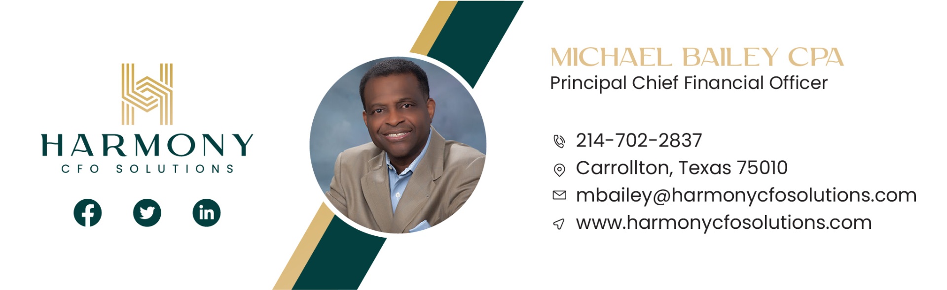
A geometric H mark built from layered parallel lines in gold on deep teal, paired with a wide-spaced serif wordmark that carries the weight and formality the financial sector demands without feeling dated. A complete brand system covering primary and secondary colour palette with five colours across two tiers, four gradient combinations, and a full brand guidelines document. Stationery suite including business cards, letterhead and envelope. Email signature with live contact and social links for Facebook, LinkedIn and Twitter. Social media kit covering cover photos and banners across all three platforms. A PowerPoint presentation template built for Michael's online webinar programme, formatted to carry the same visual authority as the rest of the brand in a live presentation environment.
04 — System
Every touchpoint carrying the same visual language.
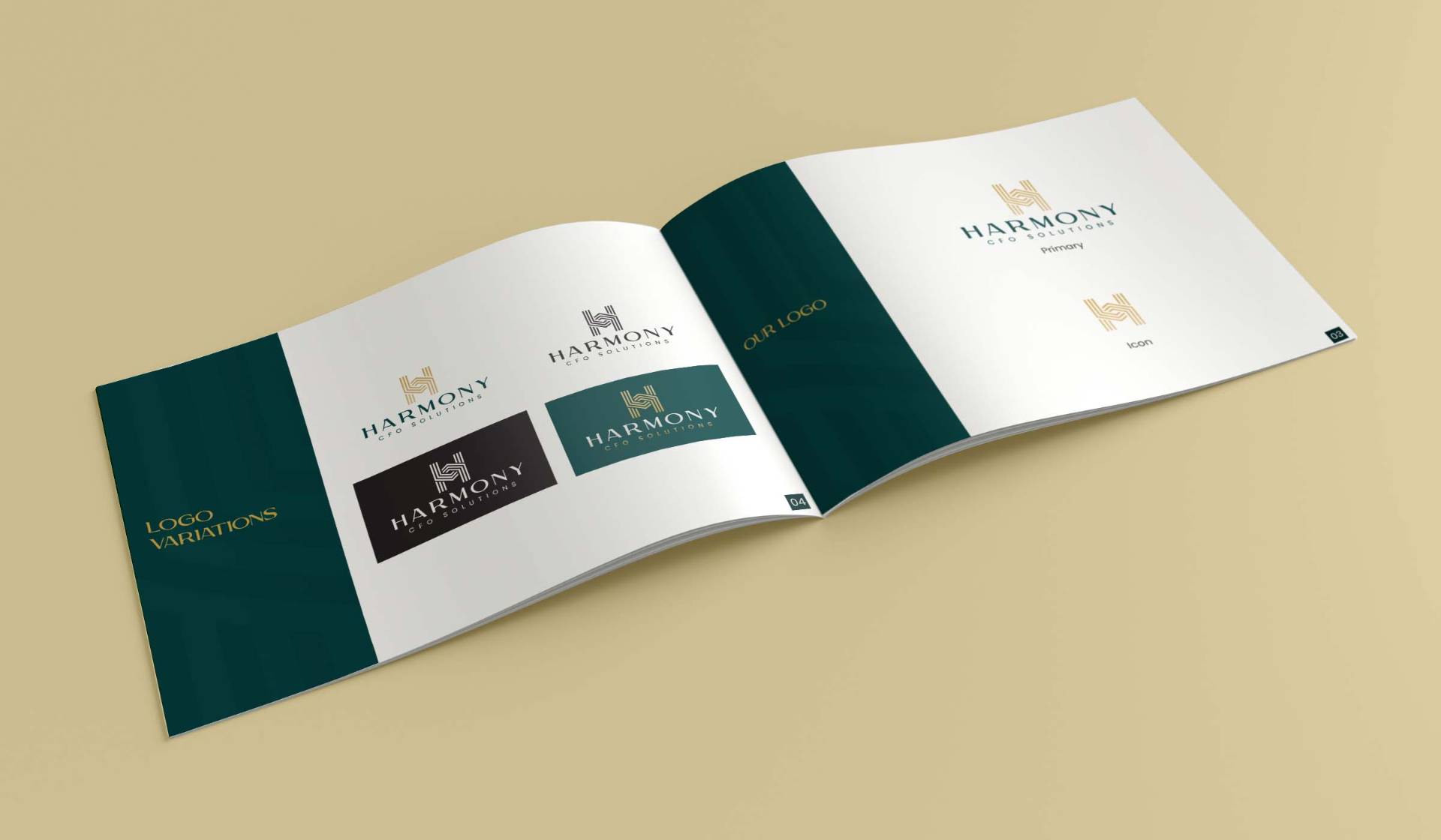
- ◆Primary logo, icon and reversed variations
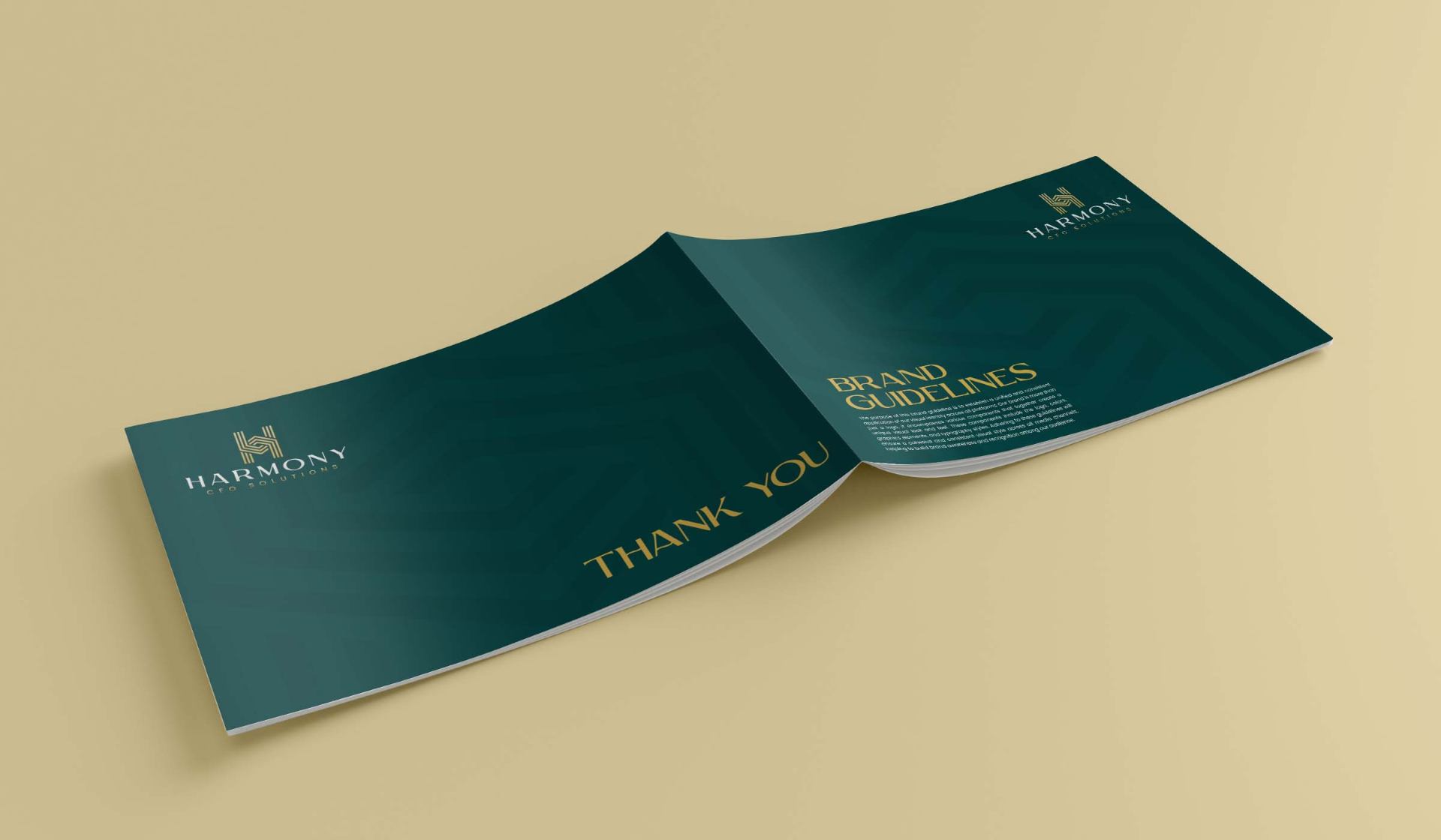
- ◆Complete brand guidelines document
- ◆Primary and secondary colour palette (five colours, two tiers)
- ◆Four gradient combinations
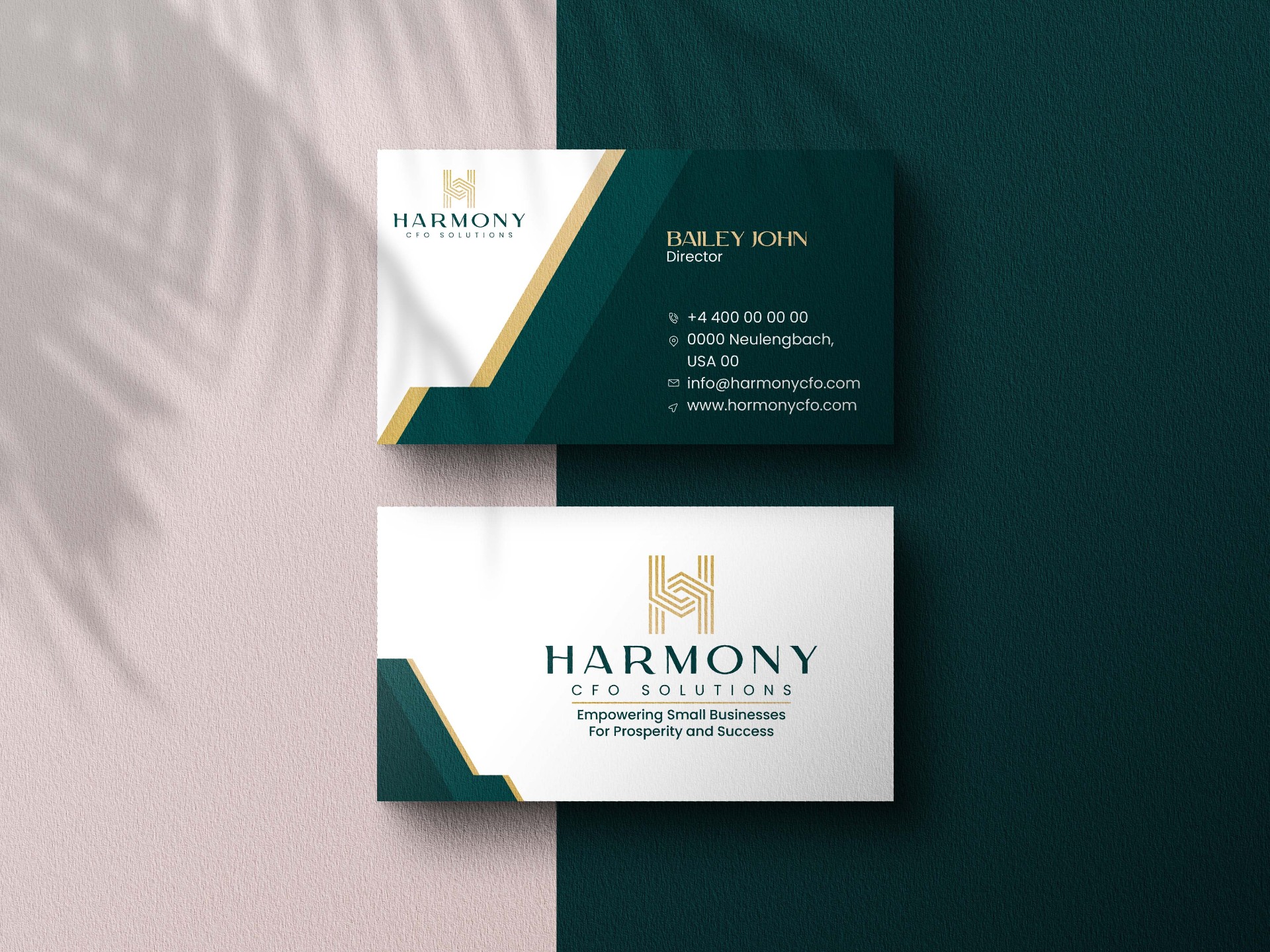
- ◆Business cards, letterhead and envelope
- ◆HTML email signature with live social links
- ◆Social media kit (Facebook, LinkedIn, Twitter)
- ◆PowerPoint presentation template
05 — Result
"Easy to work with, very accommodating and excellent work!"
Continue