Case Study 01
HIVE ZERO
Buzz to Beyond
Client
Hive Zero
Sector
Fintech Advisory
Region
Dubai, UAE
Year
2023
Role
Brand Identity, Guidelines, Stationery
01 — Challenge
A serif oval carrying the weight of a fintech firm it was never built for.
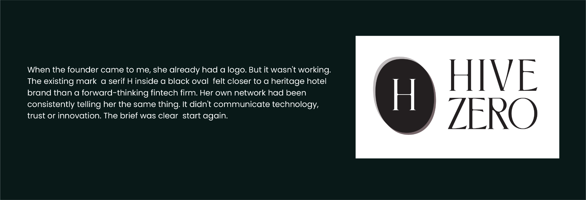
Solandia Jurdi had built a fintech advisory firm guiding startups and enterprises through blockchain and financial technology across the MENA region. Her identity did none of that work. A serif H sat inside a black oval, heavy and dated, closer to a heritage legal practice than a forward-thinking fintech firm. Her own network kept telling her the same thing. She called it halloweeny. She was right.
02 — Approach
The concept was already inside the name.
Hive Zero. A hive is built on interconnection, efficiency and collective intelligence, precisely the territory the brand needed to own in the fintech space. Rather than invent a new metaphor, the strategy was to extract what was already there and build a mark rigorous enough to carry it. Three interlocking hexagons emerged, nature's most structurally efficient shape, a form used in engineering, mathematics and architecture because nothing wastes less space or holds more strength. The H lives inside the negative space of the cluster rather than sitting on top of it. The mark rewards attention.
03 — Solution
A dark identity system built to feel structural, not decorative.
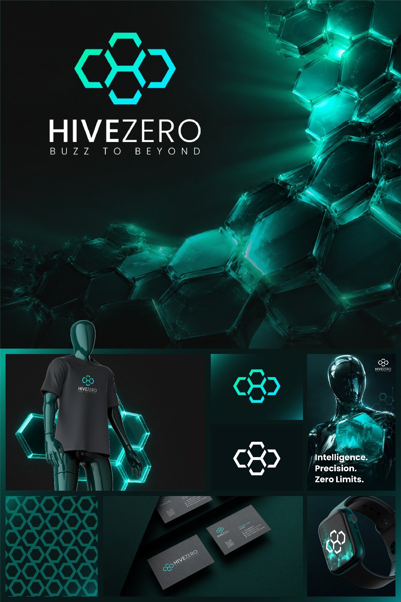
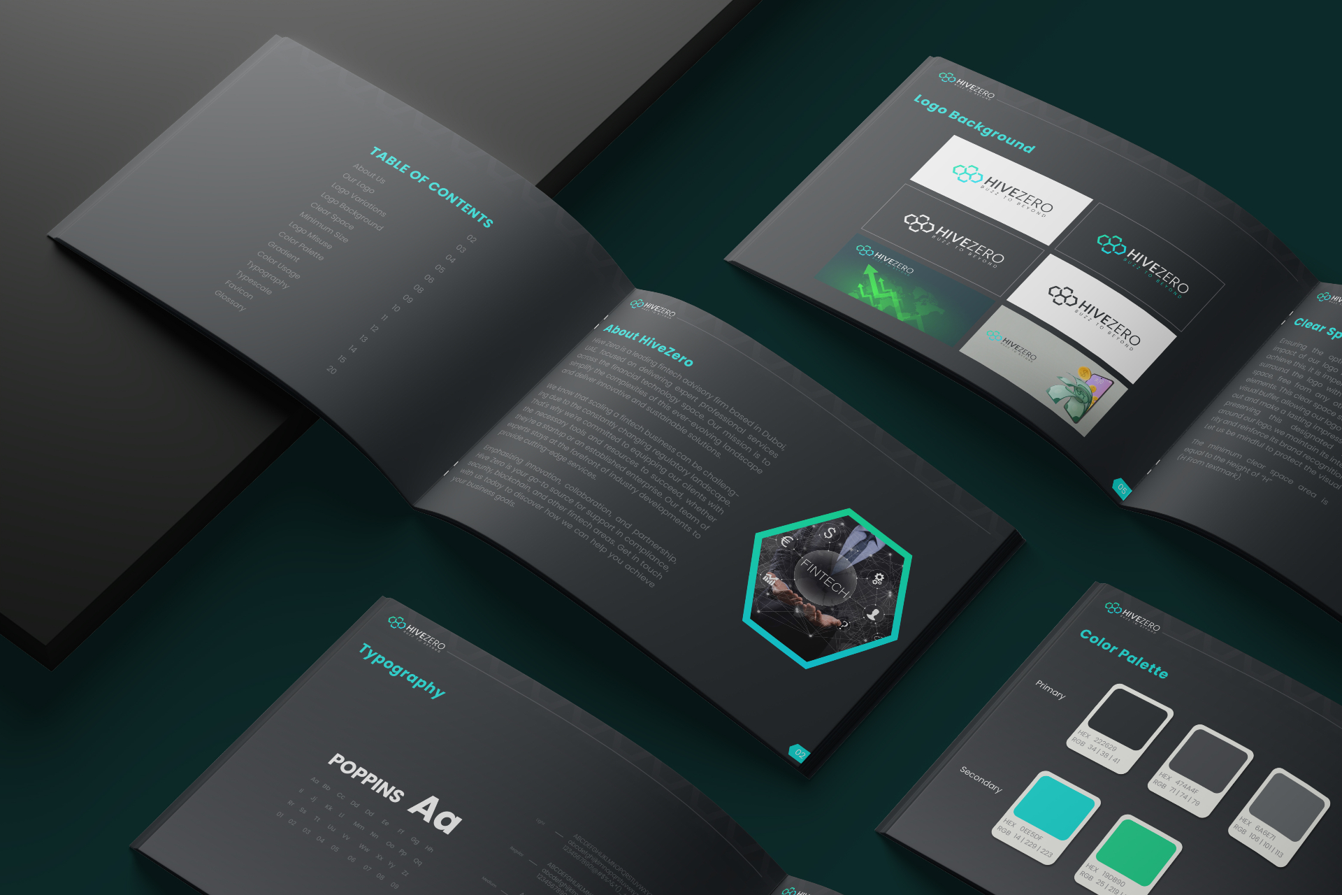
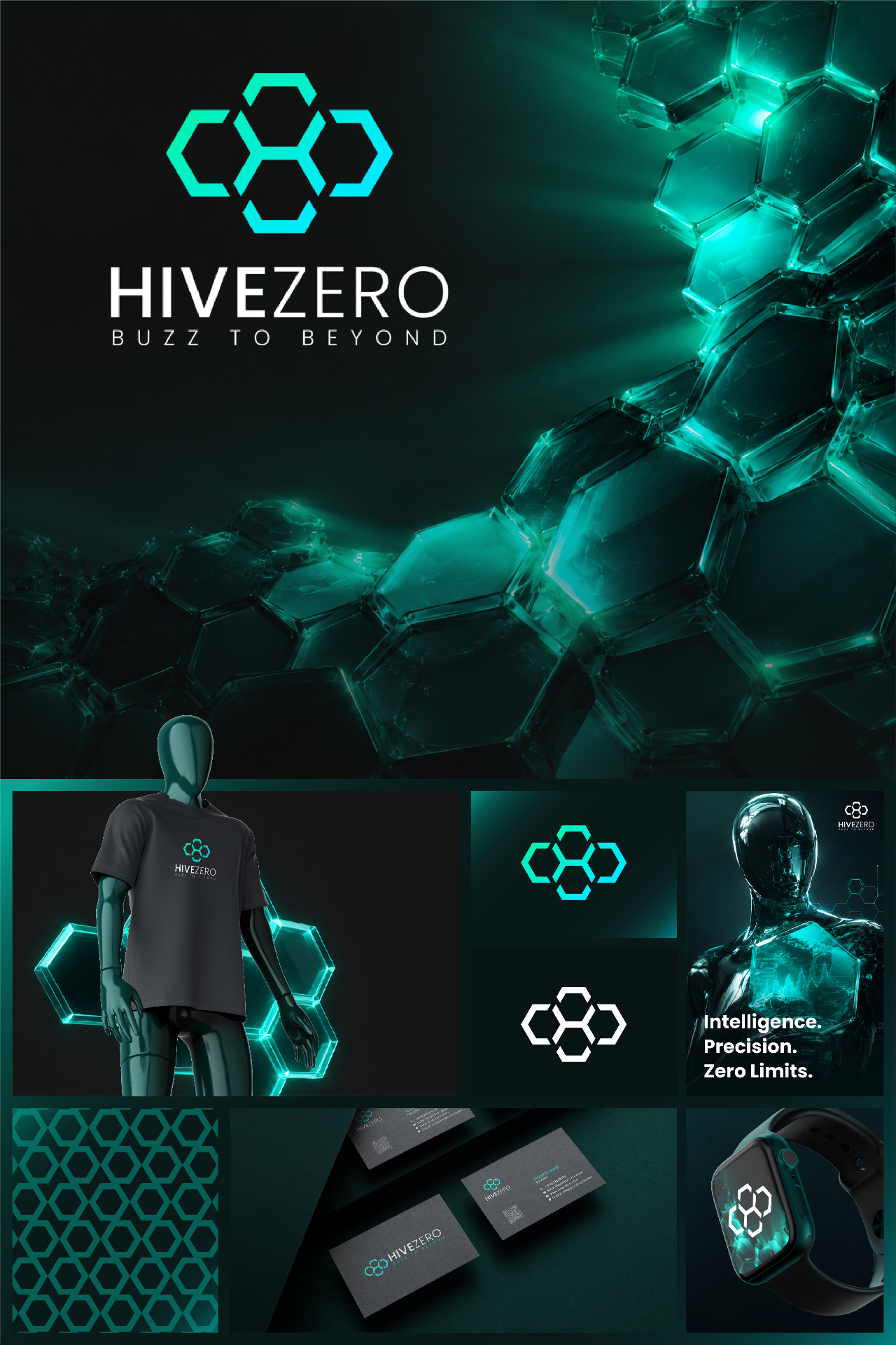
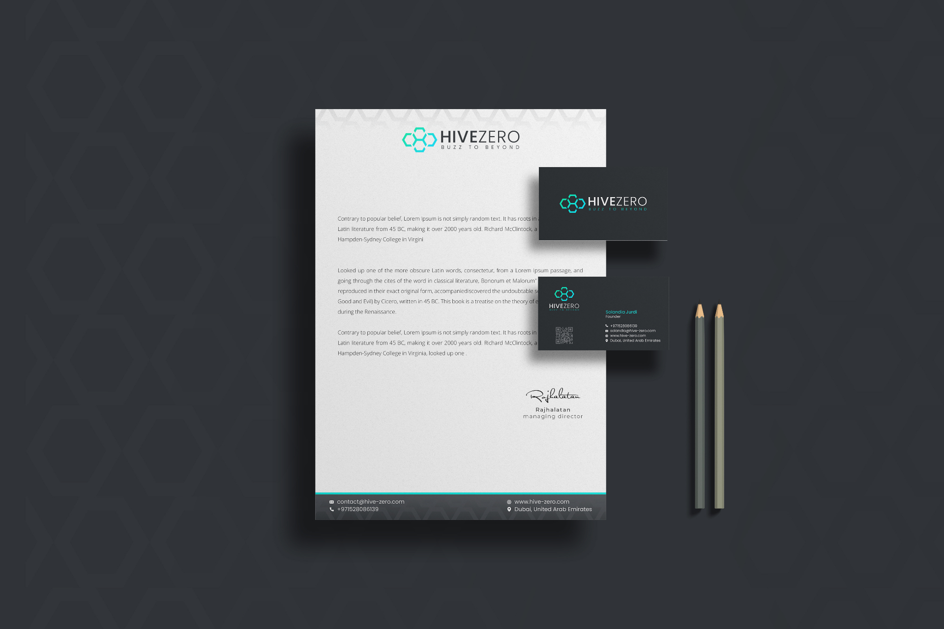
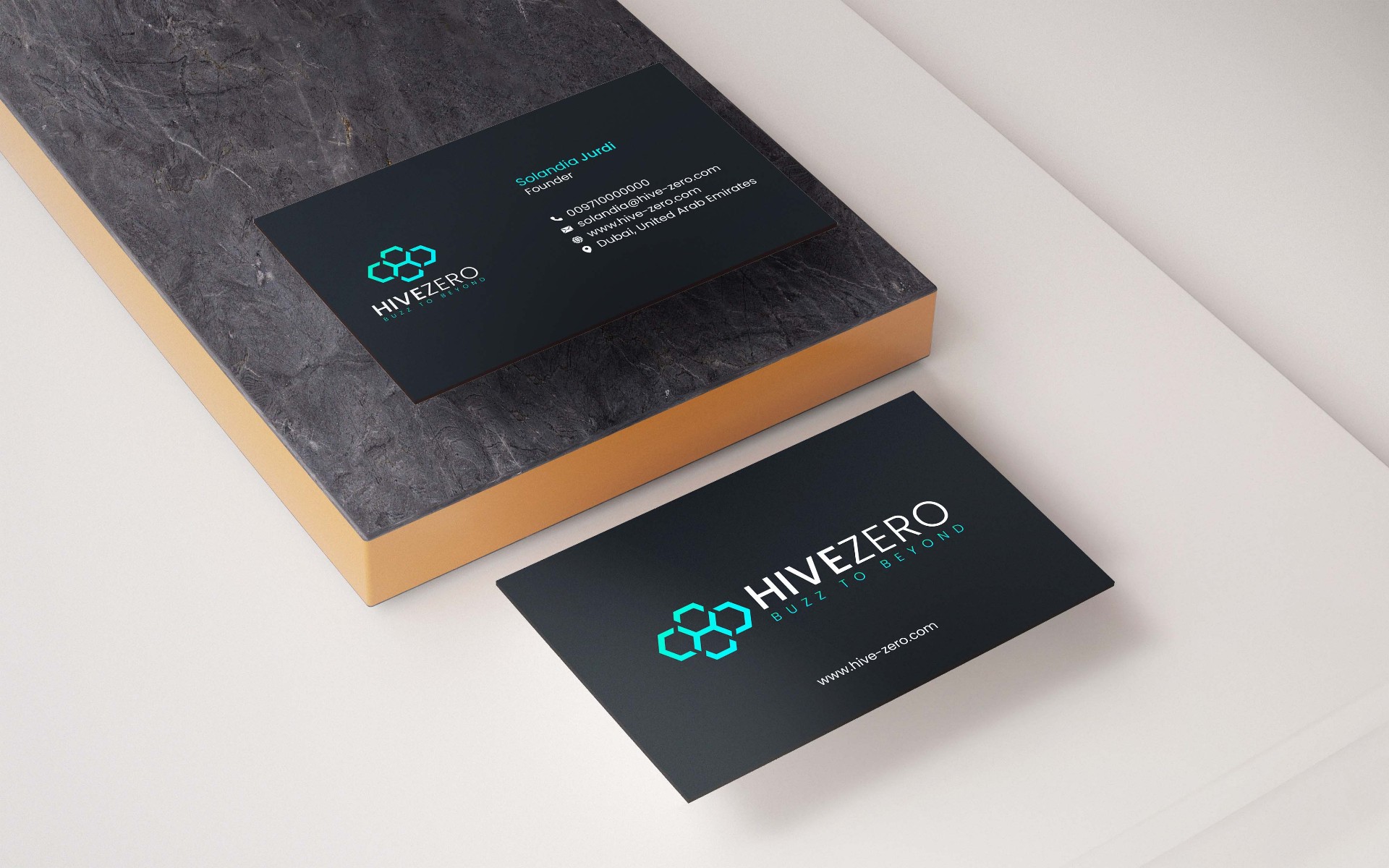
Three interlocking hexagons carry the mark, with the H embedded in the negative space between them. A teal to cyan gradient brings digital energy without decorative excess. Poppins was chosen for the wordmark, geometric and precise, legible from a business card to a full presentation deck. The tagline Buzz to Beyond runs through the entire system. The dark charcoal palette commands authority. Every touchpoint carries the same visual language.
04 — System
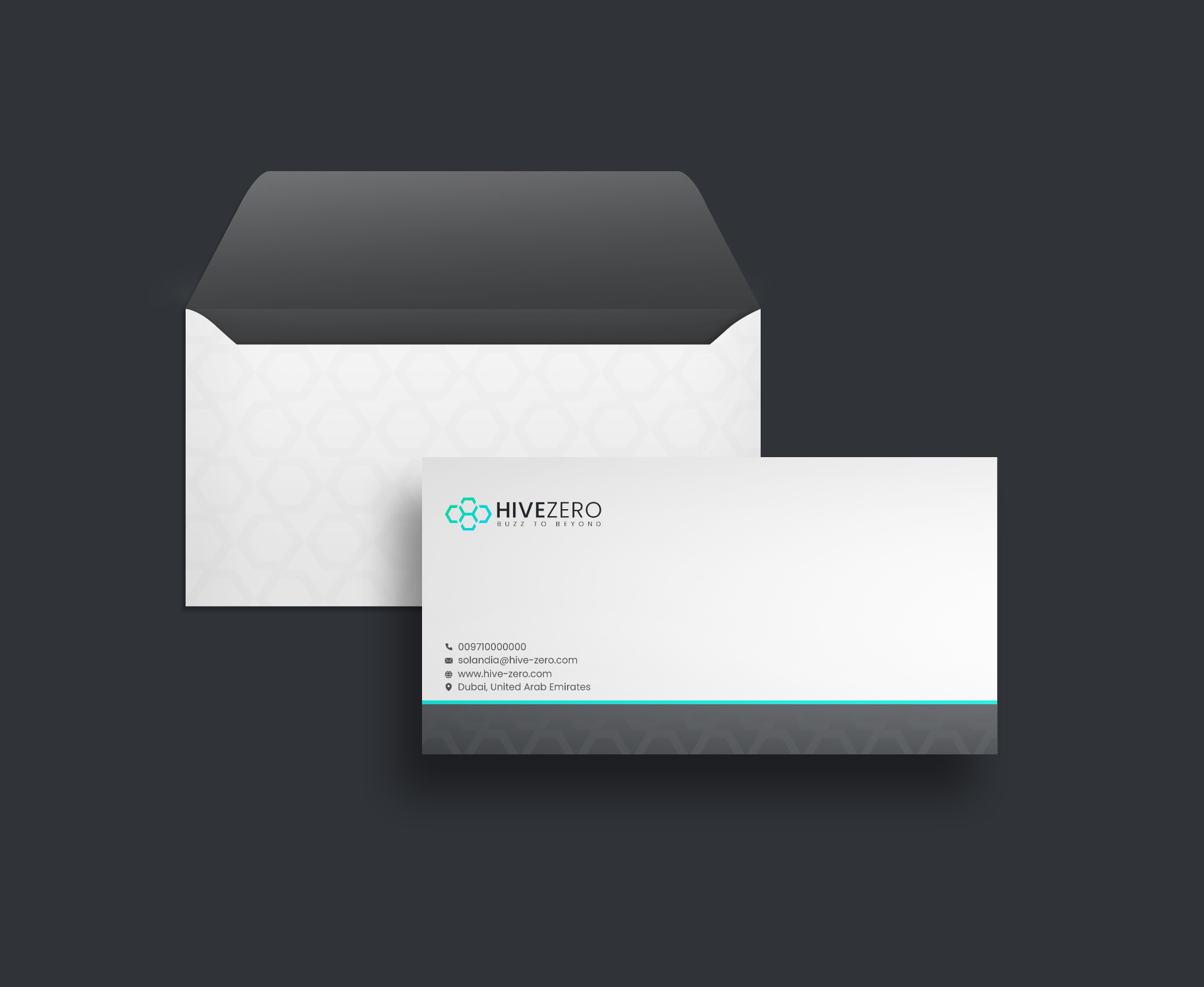
Every touchpoint carrying the same visual language.
- ◆Primary logo and mark
- ◆Full logo suite (monochrome, reversed, icon-only)
- ◆Brand guidelines document
- ◆Business cards (spot UV ready)
- ◆Letterhead (editable Word template)
- ◆Envelope and presentation folder
- ◆HTML email signature with live social links
- ◆Social media kit
05 — Result
"Working with Navid has been truly amazing. He is very professional, highly skilled, patient and cooperative. Would definitely recommend to everyone."
Continue