Case Study 06
INTELLITECHNE
Powering the future with intelligent tech.
Client
IntelliTechne
Sector
Technology Consulting
Region
Cloud Services
Year
2024
Role
Brand Identity, Guidelines, Environmental
01 — Challenge
Eleven years of trust wrapped in a stock-icon logo.
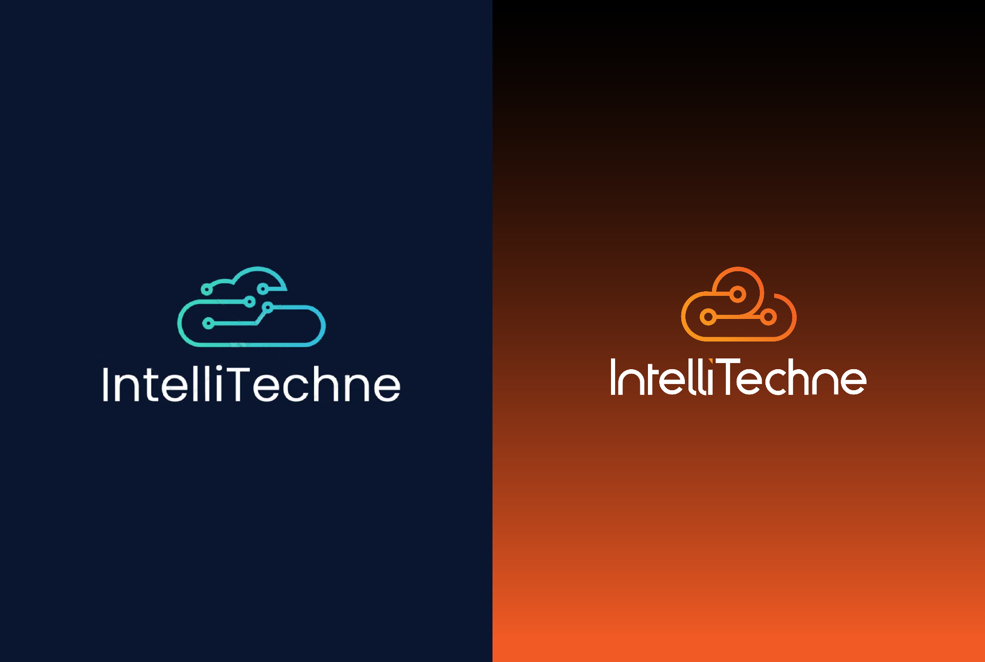
IntelliTechne had eleven years of experience behind it. A proven track record in cloud transformation, cybersecurity and IT support. A client base that trusted them with their entire digital infrastructure. And a logo that looked like it came with a free website template. The existing mark was a teal circuit cloud, functional, generic, forgettable. It communicated technology the way a stock icon does. Nothing about it said eleven years. Nothing about it said trust. For a company whose entire proposition is helping other businesses move forward with confidence, the brand was stuck.
02 — Approach
Keep the concept. Rebuild the weight, the geometry and the colour.
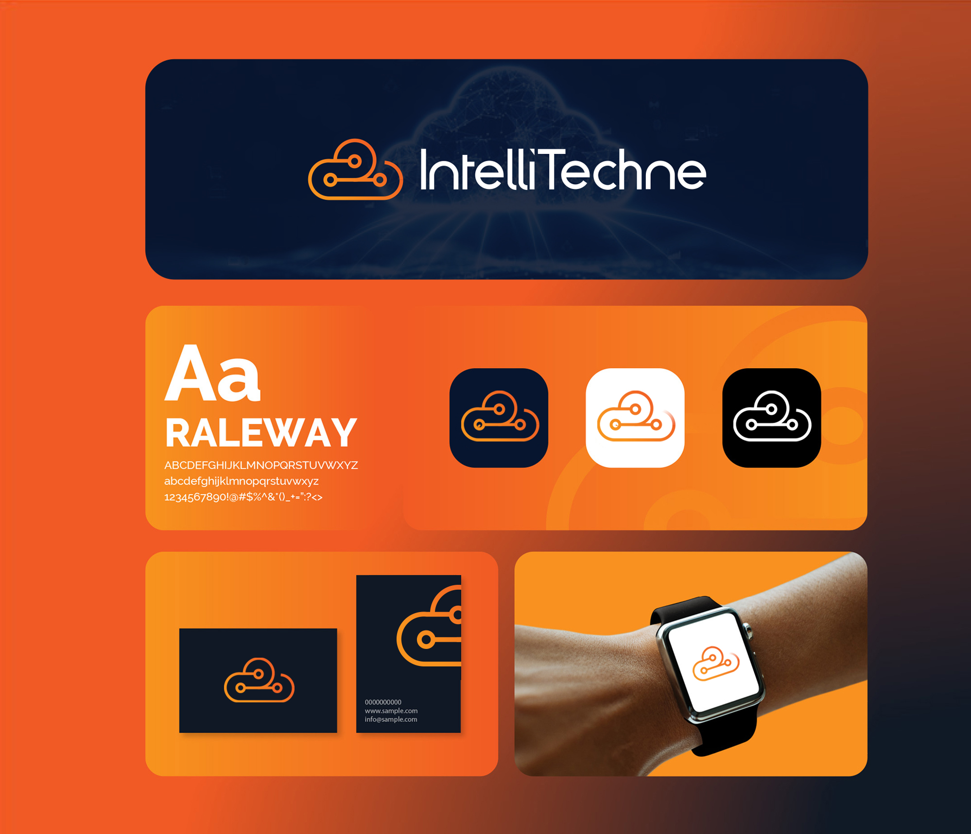
The cloud connectivity concept was worth keeping. The execution was not. The strategic decision was to retain the core idea, a cloud mark with data nodes built into it, and rebuild everything around it with the weight and energy the company had earned. Colour was the first call. Teal reads safe and passive. For a company built on forward motion, digital transformation and future-proofing, the palette needed to shift toward something that carried momentum. Orange was chosen not for decoration but for what it communicates before a single word is read: energy, confidence, action. The cloud form was rebuilt with cleaner geometry and the connectivity nodes simplified to feel purposeful rather than illustrative. The wordmark was set in Raleway with deliberate split weighting, Intelli light and Techne bold, so the two halves of the name carry different visual tension, referencing the balance between intelligent thinking and technical execution that sits at the heart of what the company does.

03 — Solution
An orange cloud connectivity system on a confident navy foundation.
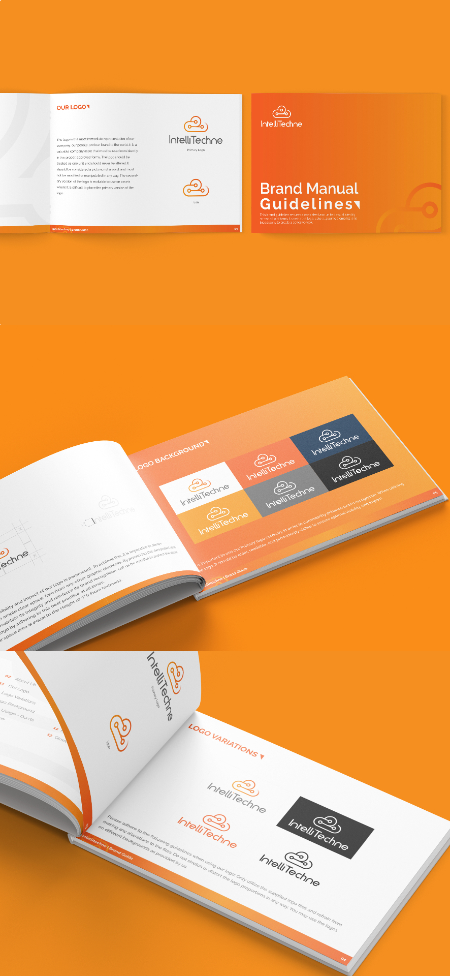
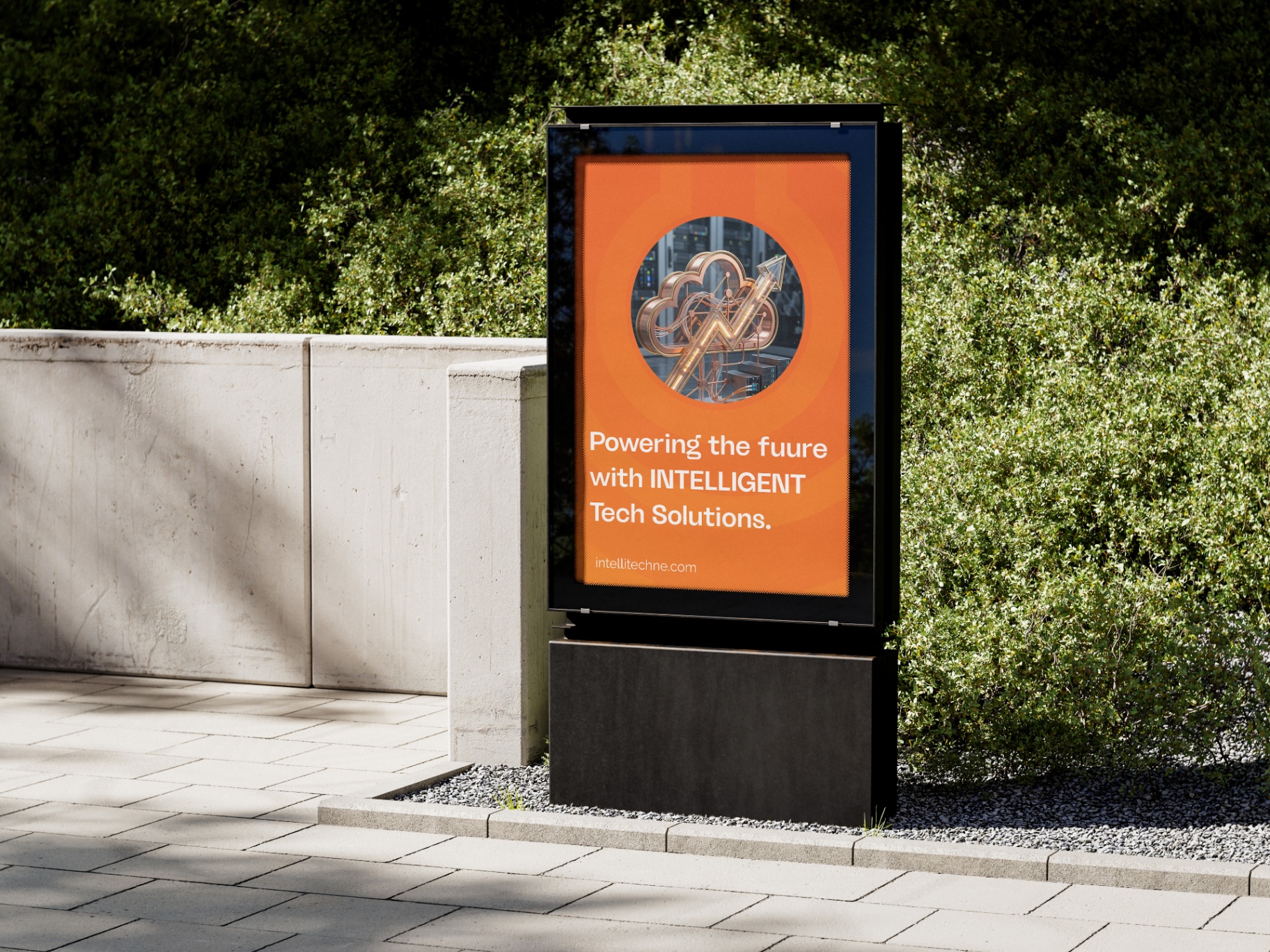
A full brand revamp built around an orange cloud connectivity mark on a dark navy foundation. Logo suite covering primary, icon-only and reversed variations. A complete brand manual with colour system, typography hierarchy, logo usage rules and application guidance. Stationery suite including business cards, letterhead and branded badge. Environmental applications across outdoor billboard, promotional flags and circular wall signage. A motion asset for digital use. Every touchpoint carrying the same system, confident, warm, technical without being cold.
04 — System
Every touchpoint carrying the same visual language.
- ◆Primary logo, icon and reversed variations
- ◆Full brand manual and guidelines
- ◆Colour system and typography hierarchy
- ◆Business cards, letterhead and badge
- ◆Outdoor billboard and promotional flags
- ◆Circular wall signage
- ◆Motion asset for digital use
- ◆Application and usage guidance
05 — Result
"Perfect 👌"
Continue